-
Text to Speech WP
-
Mondok
-
Rekam
-
Booking Plugin
-
Awetube
-
Blog Layout Design
-
Fullscreen Menu Awesome
-
Accordion Awesome
-
Flyout Menu Awesome
-
Portfolio Builder
-
Testimonial Awesome
-
TAB Awesome
-
3D Menu Awesome
-
Preloader Awesome
-
Irhas
-
Logo Awesome
-
Team Awesome
-
Timeline Awesome
-
Jepret
-
- Concept Template
- Concept Slider Slideshow Three
- Concept Slider Slideshow Two
- Concept Slider Slideshow One
- Concept Round Images
- Concept Rhomboid Images
- Concept Polaroid Stack 5 Images
- Concept Grid 20 Images
- Concept Card Stack 7 Images
- Concept Carousel
- Concept Asymmetrical 4 Images
- Concept Album Grid
- Concept Album Masonry
- Concept Adora
- Concept 3 Grid Images
-
SakolaWP
-
Bluetube
-
Pesta
-
Dugem
-
Konsultan
-
Gedung
-
Maco
-
Foja
-
Kasuari
-
Buruhan
-
Sakola
-
Nikah
-
- Widget Areas
- Child Theme
- Theme Options
- Mobile Options
- Content Options
- Blog Options
- Single Post Options
- Single Portfolio Options
- 404 Options
- Page Loader Options
- Font Options
- Live Customizer
- Portfolio Post
- Page Template
- Footer Options
- Default Template
- Page Builder Template
- Show Remaining Articles2 Collapse Articles
-
Kedavra
-
- Page Template
- Page Template - Default
- Page Template - Blog Masonry Template
- Page Template - Blog Sidebar Template
- Page Template - Contact Template
- Page Template - Full Width Portfolio Template
- Page Template - Gallery Template
- Page Template - Portfolio Grid Template
- Page Template - Portfolio Masonry Template
-
- Page Builder
- The Row
- Add a Widget Block
- Page Builder - About Block
- Page Builder - About Two Side Block
- Page Builder - Author Block
- Page Builder - Button Block
- Page Builder - Clear Block
- Page Builder - Counter Block
- Page Builder - Feature Block
- Page Builder - Full Portfolio Block
- Page Builder - HTML Block
- Page Builder - Hero Image Block
- Page Builder - Hero Slider Block
- Page Builder - Image Block
- Page Builder - Menu Block
- Page Builder - Newsletter Block
- Page Builder - Partner Block
- Page Builder - Portfolio Custom Block
- Page Builder - Portfolio Grid Block
- Page Builder - Portfolio Masonry Block
- Page Builder - Program Block
- Page Builder - Skill Block
- Page Builder - Slogan Blocks
- Page Builder - Team Block
- Page Builder - Testimonial Block
- Page Builder - The Title Block
- Show Remaining Articles12 Collapse Articles
-
Arsitek
-
Bengkel
-
- Page Builder
- The Row
- Add a Widget Block
- Page Builder - The Title Block
- Page Builder - HTML Content
- Page Builder - Testimonial Block
- Page Builder - Service Block
- Page Builder - Team Block
- Page Builder - Partner Block
- Page Builder - Latest Blog Block
- Page Builder - Slider Block
- Page Builder - FAQ Block
- Page Builder - Form Block
-
Smaze
-
- Page Builder
- Page Builder - Add Row
- Page Builder - Add Widget
- Page Builder - Headline Block (The Title)
- Page Builder - The Title Style 2
- Page Builder - HTML Content Block
- Page Builder - Testimonial Block
- Page Builder - Feature Block
- Page Builder - Service Tab block
- Page Builder - Service List Block
- Page Builder - Portfolio Block
- Page Builder - Author Block
- Page Builder - Team Block
- Page Builder - Stats Block
- Page Builder - Pricing Block
- Page Builder - Partner Block
- Page Builder - Process Block
- Page Builder - Latest Blog Block
- Page Builder - Skill Block
- Page Builder - Button Block
- Page Builder - Slider Block
- Page Builder - Toogle Block
- Show Remaining Articles7 Collapse Articles
-
Foto
-
Gede
-
- Page Builder - Text
- Page Builder - Visual Editor
- Page Builder - Column
- Page Builder - Clear
- Page Builder - Widgets
- Page Builder - Alerts
- Page Builder - Tabs & Toogle
- Page Builder - Text Shortcode
- Page Builder - Team
- Page Builder - Service
- Page Builder - Full Page Section
- Page Builder - About
- Page Builder - Facts
- Gede - Page Builder
-
Djompo
-
Apper
-
- Apper - Page Builder
- Page Builder - Text
- Page Builder - Visual Editor
- Page Builder - Column
- Page Builder - Clear
- Page Builder - Widgets
- Page Builder - Alerts
- Page Builder - Tabs & Toogle
- Page Builder - Full Page Section
- Page Builder - Features Icon
- Page Builder - Bord
- Page Builder - Testimonial
- Page Builder - Service
- Page Builder - Gallery iPhone
- Page Builder - Gallery iPad
- Page Builder - The Title
- Page Builder - Partner
- Page Builder - Pricing Table
- Page Builder - Available Device
- Show Remaining Articles4 Collapse Articles
-
Bow
-
- Bow - Changelog
- Why vimeo link doesn't work in my site?
- How to change "menu" image or to add text?
- How to control time of image slide in home slider?
- how to disable the fading (fadeinup-order) of the non-active features on the post loop side?
- How can I change site title "Frank Bow" 's color or replace it with a Logo Image?
- Work Page problem after installing new version get message: "Fatal error:....page-work.php on line 69"
- How to disable the infinite scroll?
- How to set speed home page slider?
- How to sort or order gallery category?
- How to change the text "Discover" on home page?
- How to change name at All Category or use specific category
-
Merapi
-
Template Kits Elementor
-
Rinjani
-
Kindergarten
-
Logitrans
-
Cleaning
-
- Page Builder
- The Row
- Add a Widget Block
- Page Builder - The Title Block
- Page Builder - HTML Content
- Page Builder - Feature Block
- Page Builder - Testimonial Block
- Page Builder - Team Block
- Page Builder - Latest Blog Block
- Page Builder - Slider Block
- Page Builder - Counter Block
- Page Builder - Image Block
- Page Builder - Partner Block
- Page Builder - Pricing Table Block
- Page Builder - Service Block
-
Gapura
-
Hakim
-
Finance
-
Inhousekai
-
Musisi
-
Seniman
Post Type – Album
This post will display in home page. You can add a gallery inside this album.
Step by step :
- Enter title here.

- Fill the text editor with your content.
- Add image here and the image will display as featured image.

Like page template, post type have a “Page Title” option. This option only work for Album post type. If you allow “Use Concept Title” box, your title will show above gallery section. You can set a background image and text align with this feature.
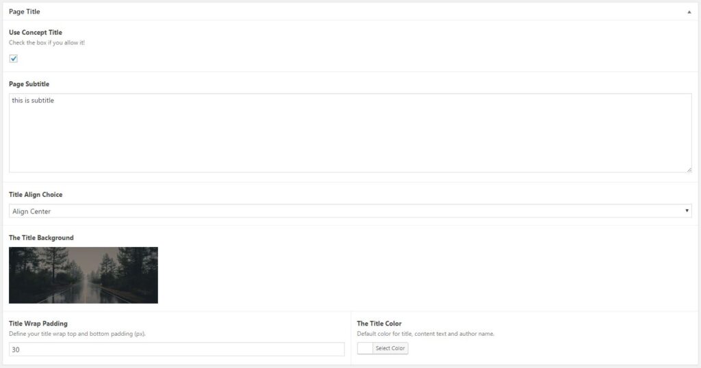
Album page title result:

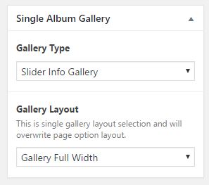
This post type have 12 basic layout. You can choose it at “Single Album Gallery” option.
You can set that option below publish button on your post editor sidebar.
- Default Creative Grid/Masonry
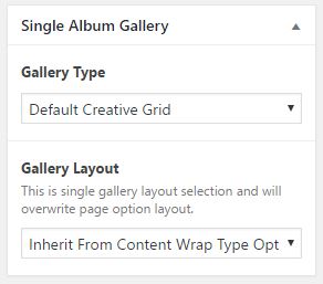
Default Creative Grid/Masonry (depend on your image height) is a static gallery layout. You can’t configure the column for gallery item. But you can set the layout wrapper.

- Polaroid Layout
Polaroid photostack gallery is a static gallery layout. This layout will showcase all of your gallery images inside a singular album post type. You can set the layout wrapper. This layout have 2 side of image frame, if you click the rotate icon (inside active bullet), your image will flipped and change into image meta data info.

You should tell your reader for this info using gallery subtitle or content editor. So they can know where to read the info eventhough we provide that icon inside active navigation bullet.
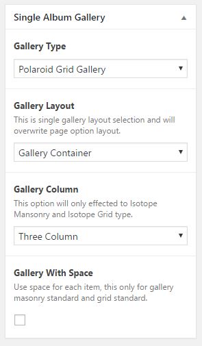
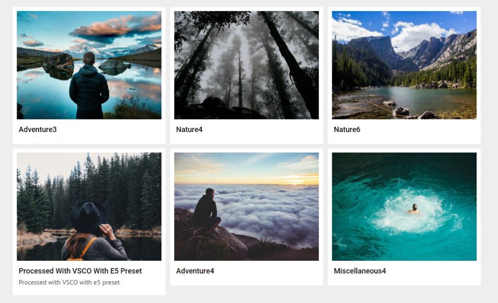
- Standard Grid
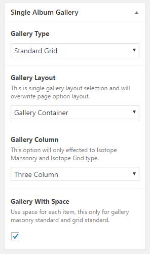
Standard Grid Gallery have it’s own feature. You can set the gallery image column from 2 column until 5 column images. You also be able to configure gallery layout with container or fullwidth or even inherit from “Theme Options”. This gallery also allowing you to enable/disable space between each image.
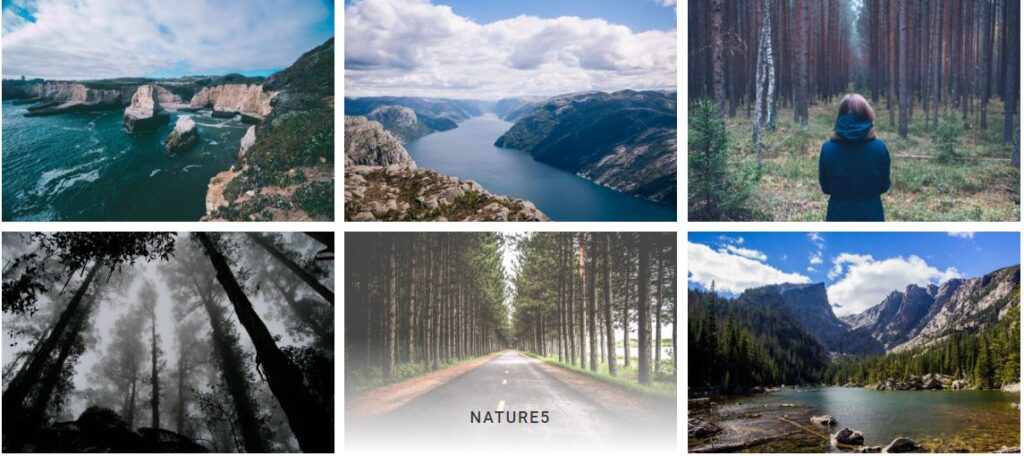
Grid Gallery will crop your image as same size. Please upload an iamge with 940×705 pixels size dimension if you want to use this layout. From example image above, we use container layout with Three Column and Gallery With Space selected.
- Standard Masonry
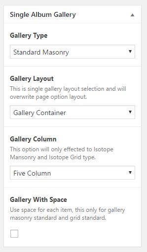
Standard Masonry Gallery have it’s own feature. You can set the gallery image column from 2 column until 5 column images. You also be able to configure gallery layout with container or fullwidth or even inherit from “Theme Options”. This gallery also allowing you to enable/disable space between each image.
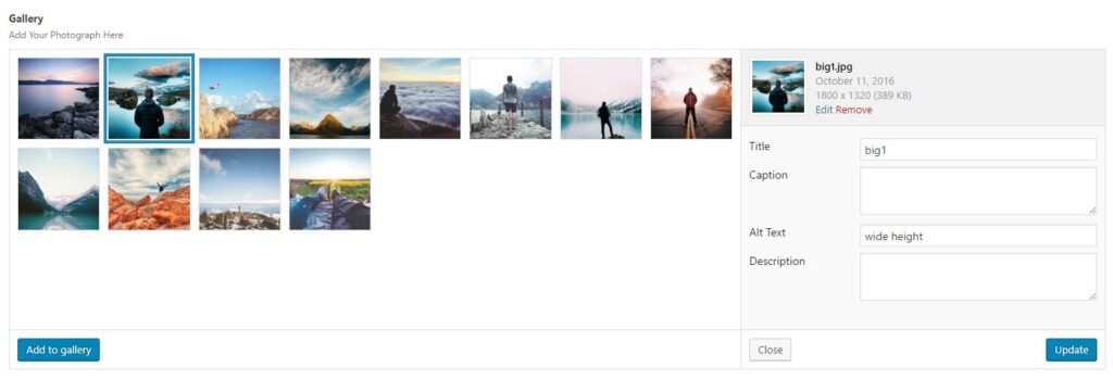
Masonry gallery had special feature class for each gallery image. As you can see at the example image below, the second image have double width from normal gallery image. From the gallery image option above, you can set “wide” attribute at “Alt Text” to make your image larger (2x normal image). “Height” attribute will make your selected image have double height from normal image. Default height image (long image ones, like 4th image) is default iamge without any attribute.
From image above, we use four column with space masonry gallery layout.
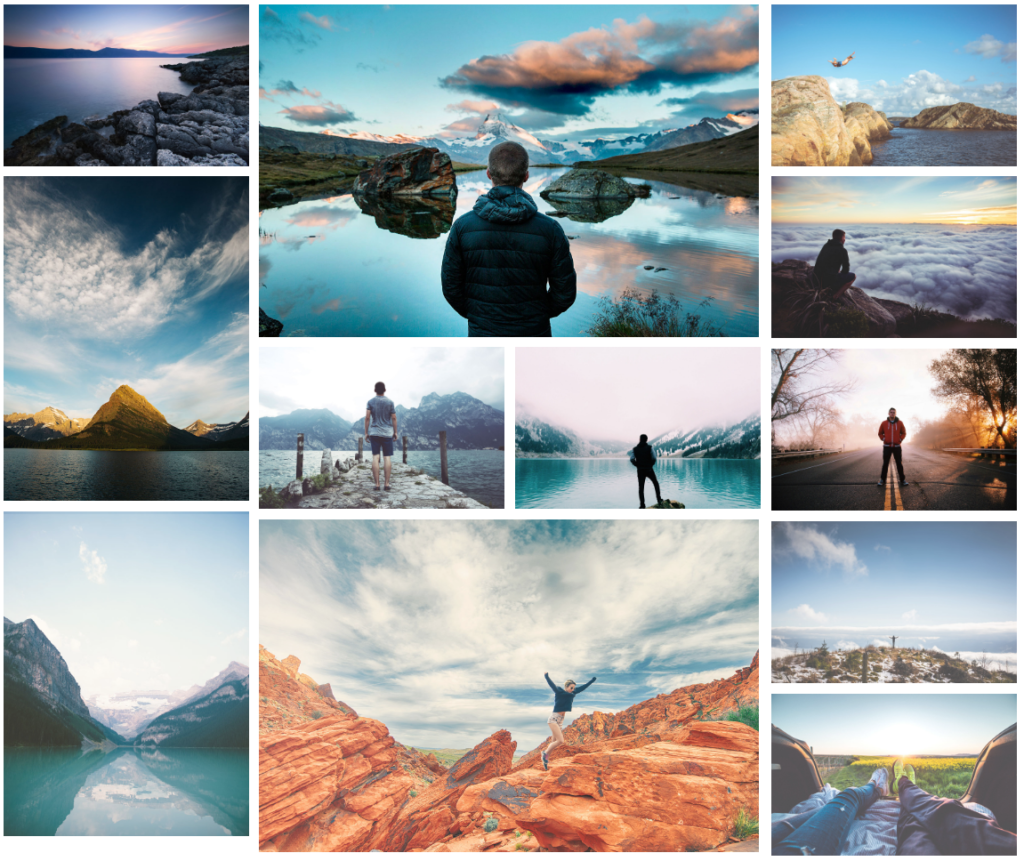
- Grid Swap Effect
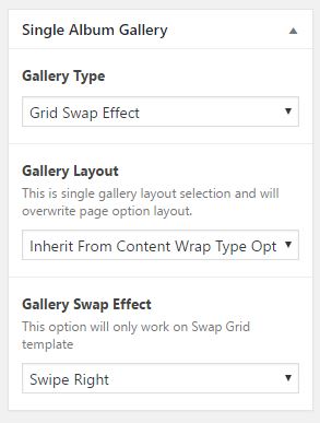
Same with Concept Swap Grid, this gallery have it’s option callerd “Gallery Swap Effect”. There are 3 different effect that you can use for this gallery load image effect.
This layout need a lot of images to make the windows scroll and load your images with this effect. Picture above is an example for image are loaded and being loaded.
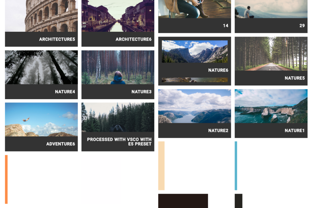
- Grid Expand Gallery
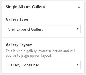
This layout have static column with 2 image per row. You only be able to choose content wrap type with this gallery with container or fullwidth.
This gallery will make your image larger (normally to default size) after you click an item. No description or meta info for this layout.
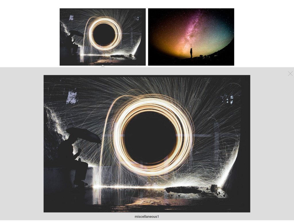
- Full Slider Gallery
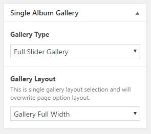
Same with Concept Slit Slider ( Fullwidth Slider ), the layout looks better with full width gallery layout.

Your gallery will turn into light box after you hit “VIEW MORE” button inside slider content.
- SVG Grid Gallery
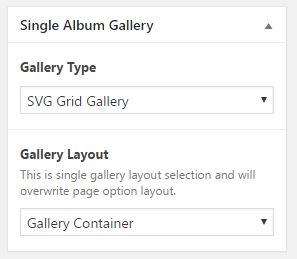
Same with SVG Grid Concept template, the layout looks better with full width gallery layout.
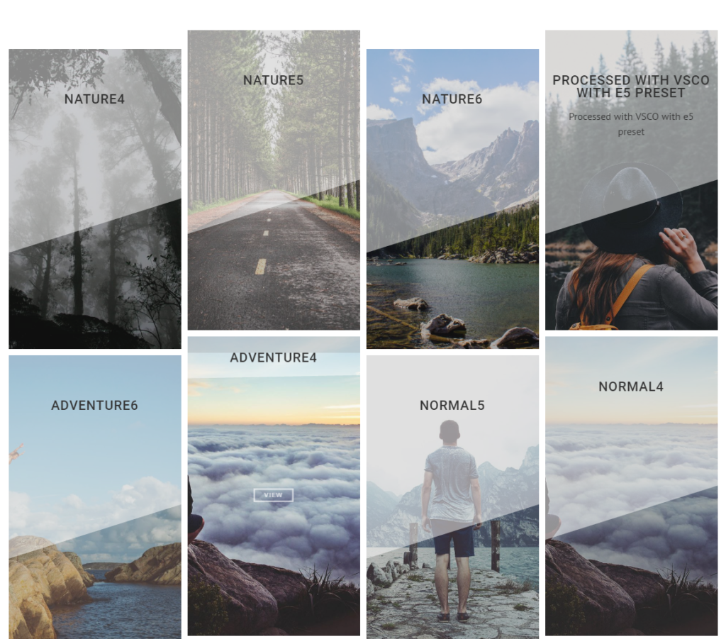
Your gallery will turn into light box after you hit “VIEW MORE” button inside slider content.
- Slider Info Gallery
Same with Full Width Slider gallery, this layout disable “Gallery Layout” option useless you set it on Theme Options. The content are static with full width slider.
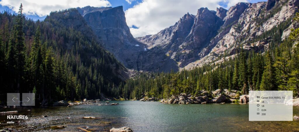
Your picture meta data will show if it available.
- List Gallery
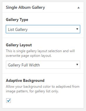
This layout will showcase your gallery image as list with image’s name and meta data detail. You can choose gallery layout type with this layout, better with full width gallery.
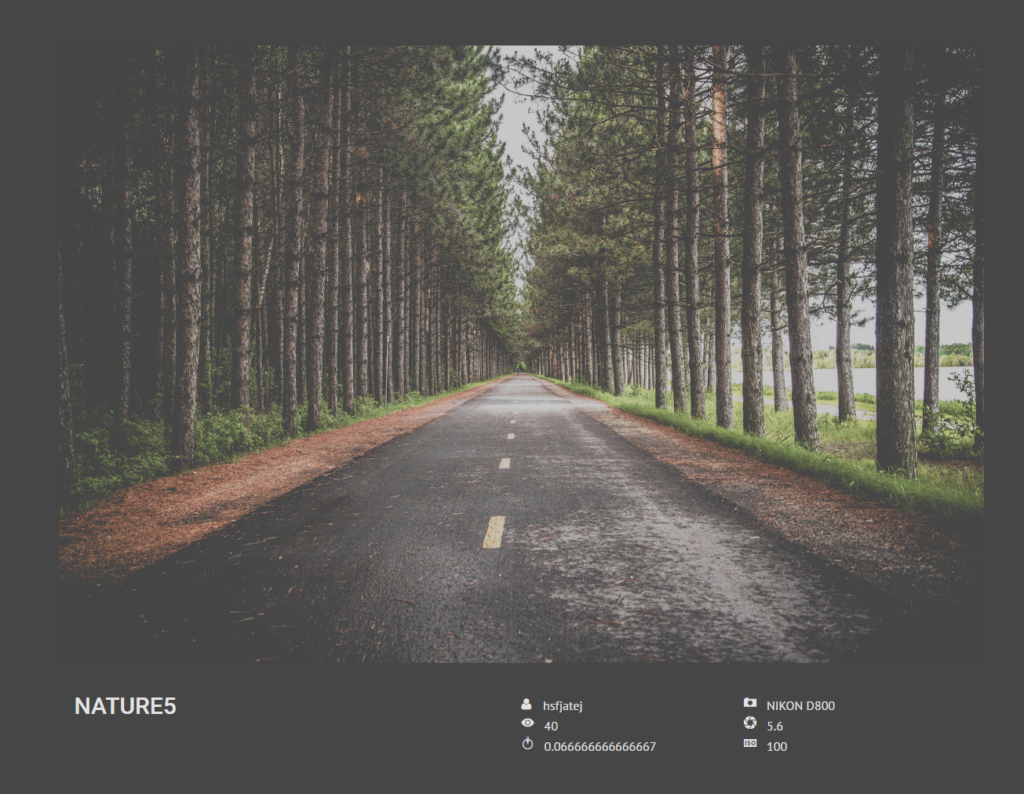
This layout allow you to activate “Adaptive Background” feature for each list. Your list background will have same color with dominant image color.
- Polaroid Grid Gallery

This layout will showcase your gallery images as grid with with border. You can choose the Gallery Layout type also set gallery image column.
If you decide to use this layout as your gallery, we recommend to use Gallery With Space for better look.
- Carousel Gallery
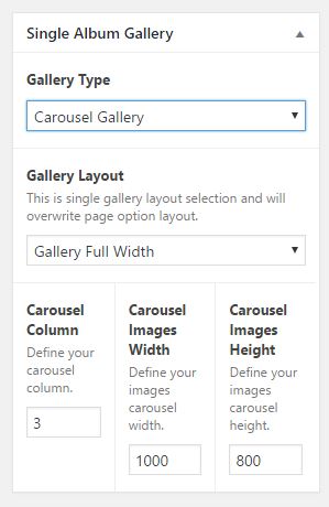
This layout will showcase your gallery images as carousel slide. This template have its own option that allow you to define the image width and height, but please note, USE IMAGE WITH DIMENSION MORE THAN YOUR CROP VALUE. Feel free to set the column of carousel image. For the example image we use 300px width, 1200px height and 8 column carousel image.
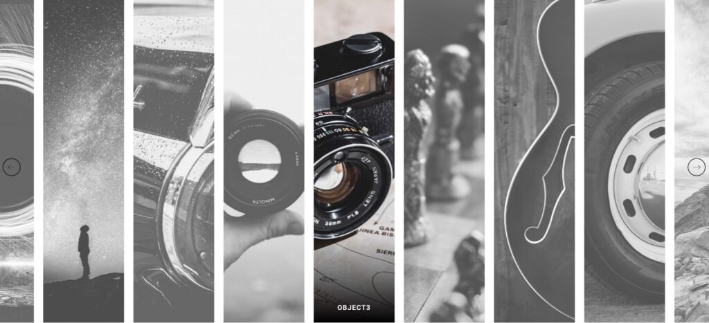
If you click every image on active carousel, your will directed into light box version of that image.